My goal for this project was to create a guided tour of downtown Mason, Ohio. When looking at my options for an area of focus in Mason, one of my first thoughts was the local restaurants that line Main Street in downtown. Most of these restaurants, bars, and cafes were completely local, which made the idea of including them in a tour that much more interesting. With that, Mason has an event known as "Music in Mason" where live music performs during the summer in a plaza on Main street near the location of potential stops. My thought process was that this tour could coincide with the live music to create a day full of good food, drinks and music.
As someone who grew up in Mason, I noticed that they have a signature style that they use in a lot of their collateral. To me this style has always worked well, and it seems fitting for who Mason identifies itself as. I kept many of the elements in that same style with a few added pieces, and moved forward with the design.
When it came to creating the logo, I have always liked the font used for "Mason" at the top of the old town hall building, which is now being used as one of the restaurants included in the tour "Two Cities Pizza". It has always been very identifiable to me, due to the warped "s" in Mason, so I felt it would make a good logo font to personalize the design specifically for Mason, Ohio.
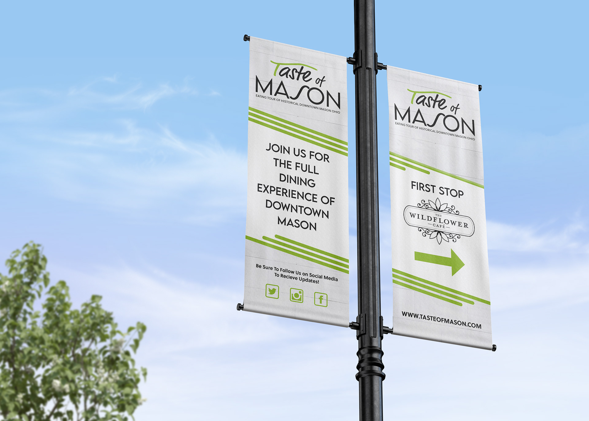
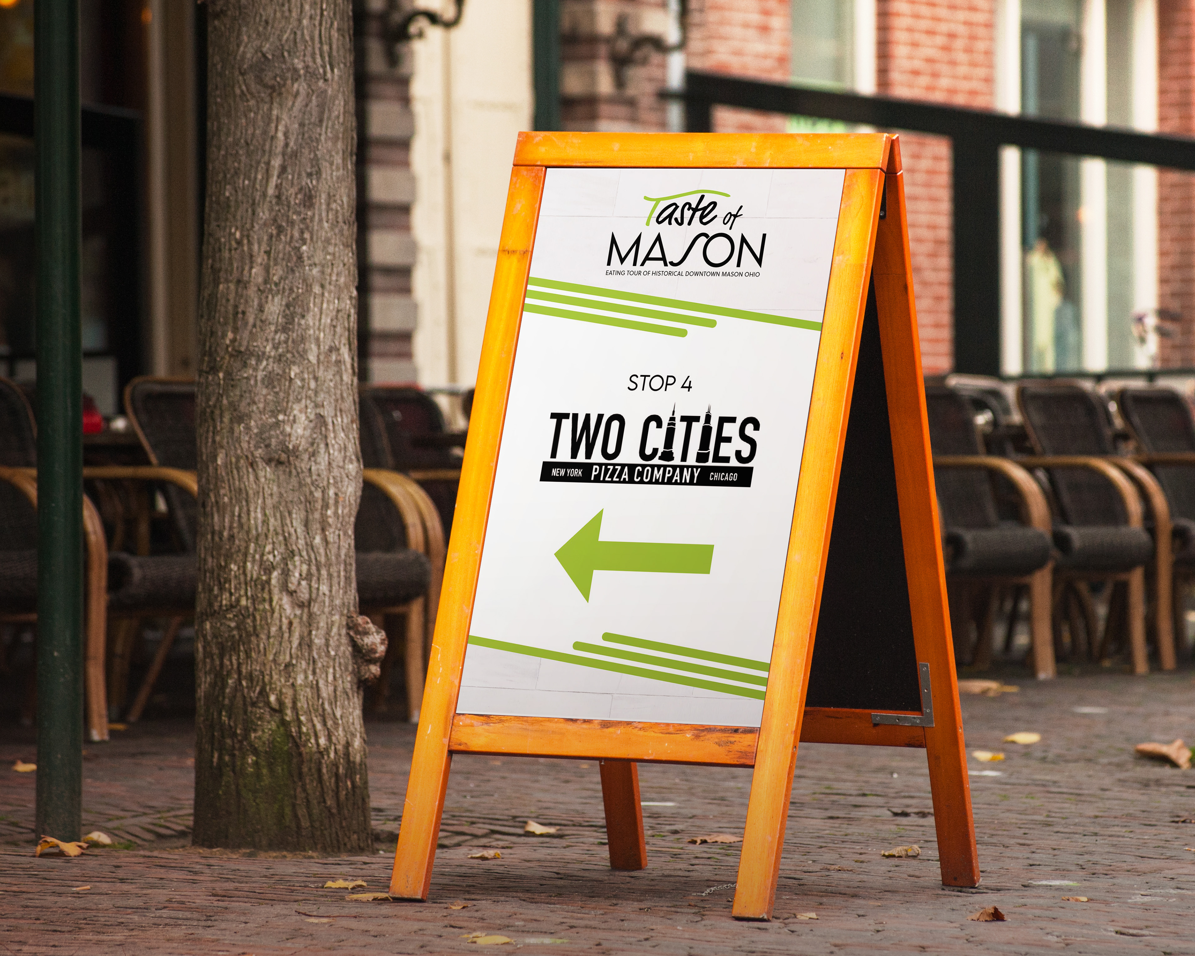
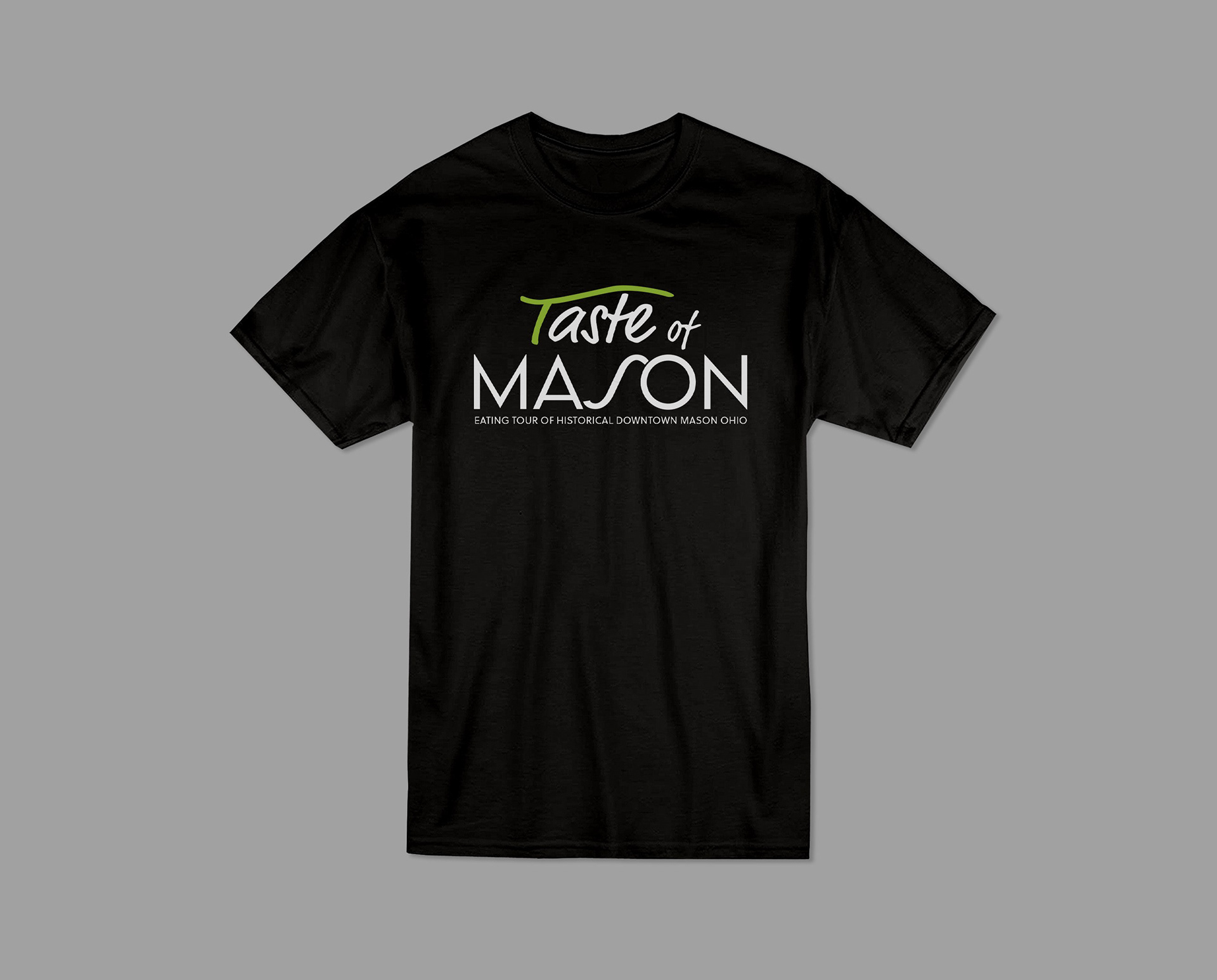
With all of the pieces together, It included a 2 page brochure that included a summary of the tour patrons would be taking, as well as a map and list of the food options included. With that there were also lamp post banners that would act as wayfinding and advertising to people in Mason as they drove through downtown, and sandwich boards outside each stop to help participants follow through the tour. I also included optional window decals that would show that a restaurant was a stop in the tour. Lastly each participant could earn a shirt as a souvenir to those who completed the tour.
