This logo was created as part of a marketing campaign run at the campus recreation center at Miami University. The goal was to try and attract new members at the beginning of the calendar year. The logo had to be comprised of the fonts that were part of Miami University's branding. For the chosen example, the primary font was Gotham. I wanted to keep it simple, yet something that will catch your eye. I believe my final design was a combination of the two, and it was part of a successful campaign on campus at Miami.
Below you can see the two final design choices that were chosen to move further with. Both incorporated similar design qualities. As this was not the first project I worked on for the rec center at Miami, I had become accustomed to the design choices that they seemed to prefer, which typically would be in the same category as the following examples.
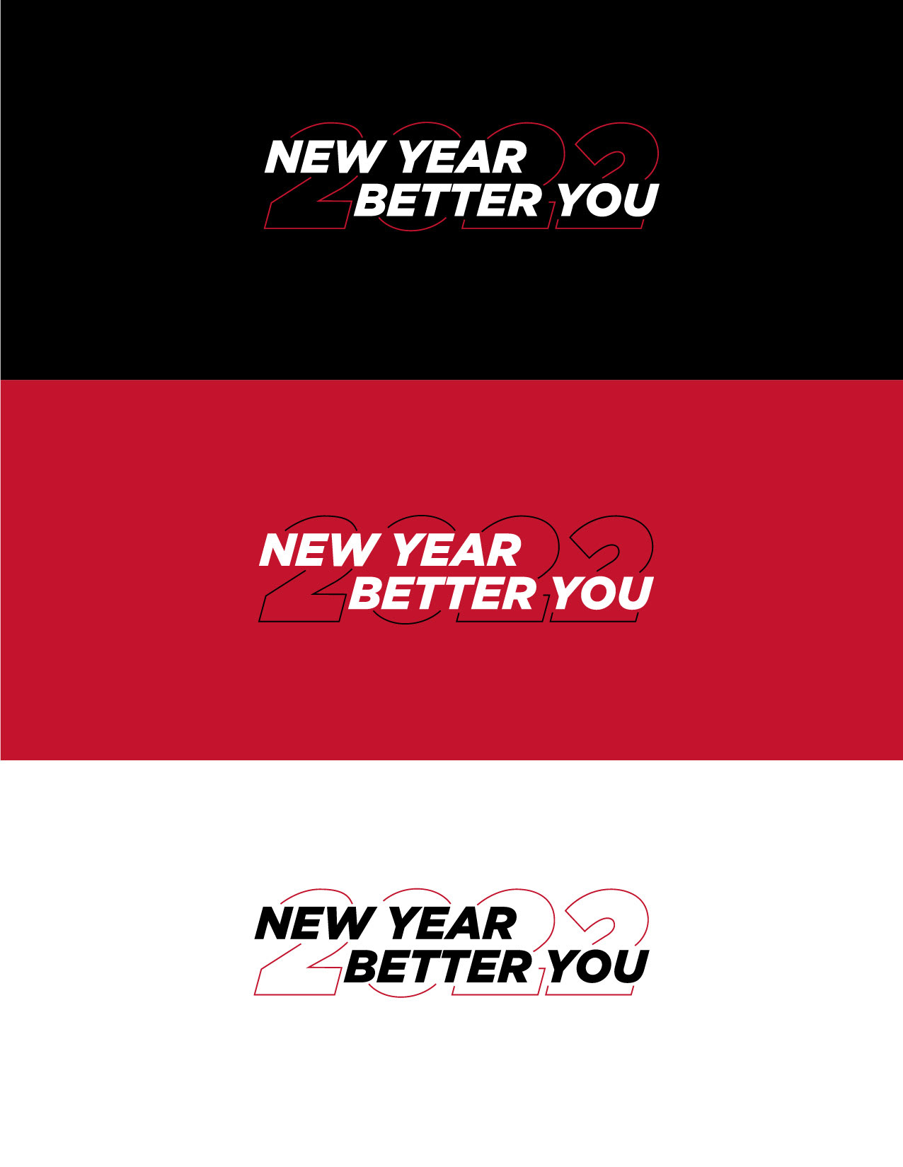
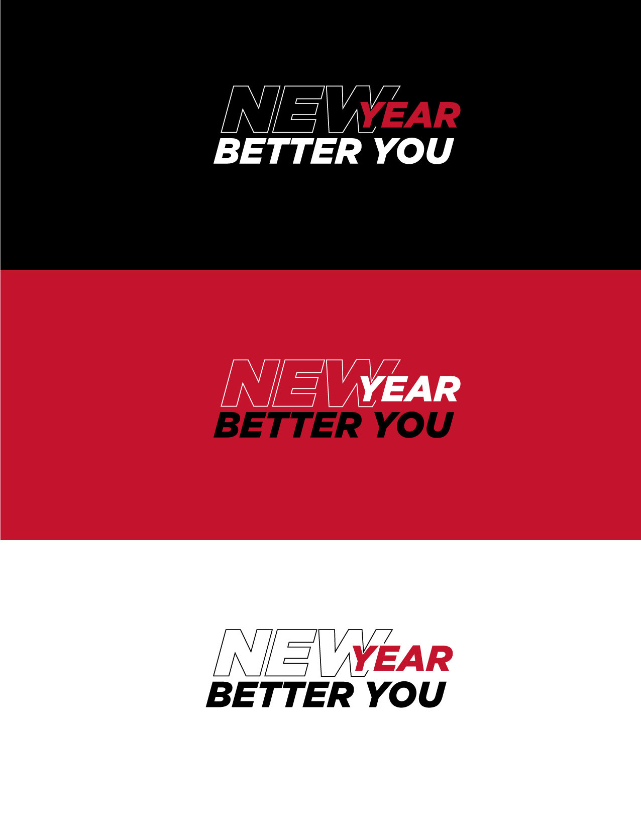
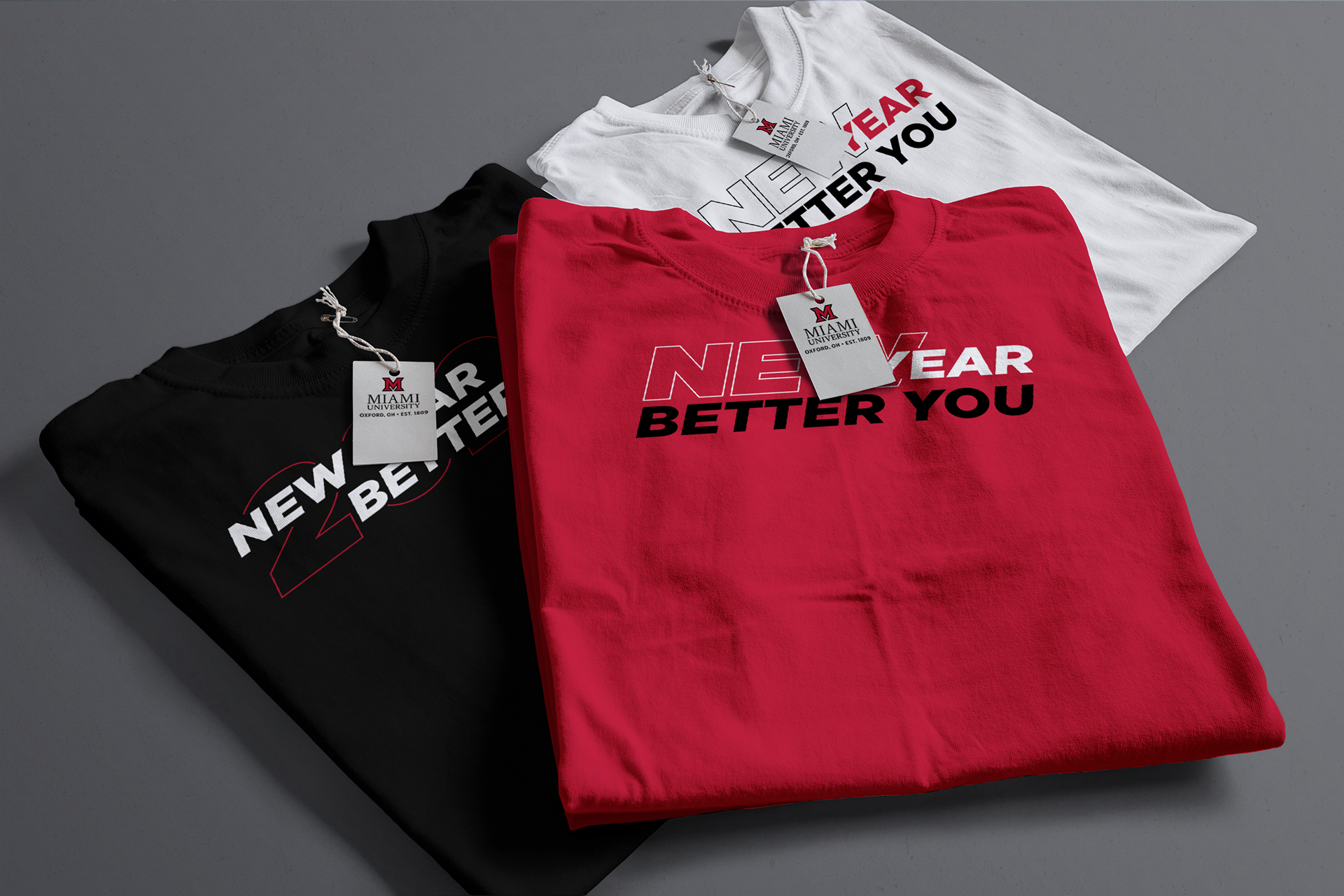
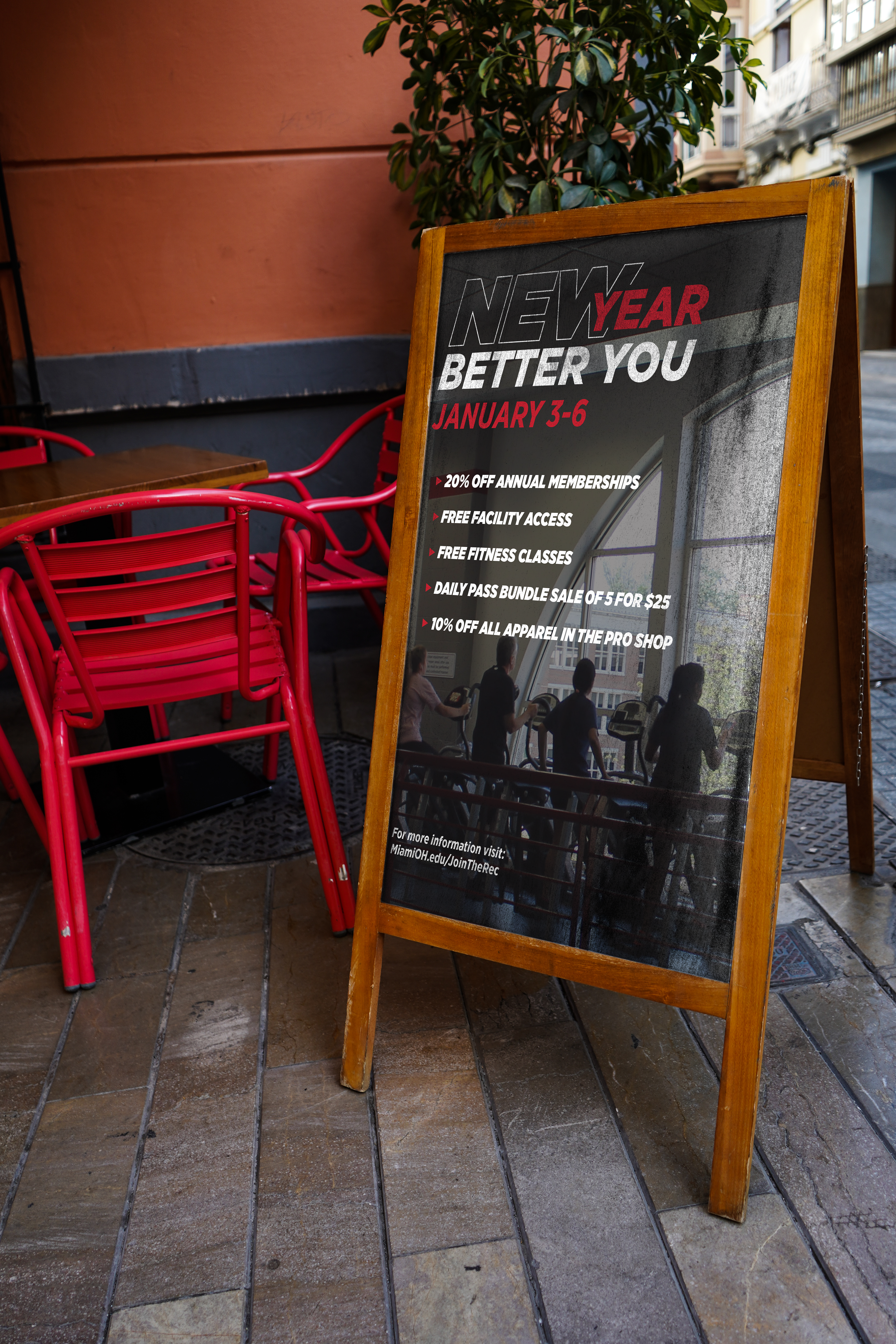
From there, the design on the right with the hallowed out "new" was chosen as the final design. I then used the logo to create social media advertisements, as well as in house digital screen advertisements. Along with that, I used the logo to create apparel and other miscellaneous merchandise.