Project Statement
For this project we were randomly assigned a famous letterpress printer or print shop. We then had to use information we gathered about them to create a 16 page booklet. This booklet had to be a combination of the information we gather about the printer/ print shop as well as images of their work, and a type specimen of a typeface that resembles something the artist may use in their work.
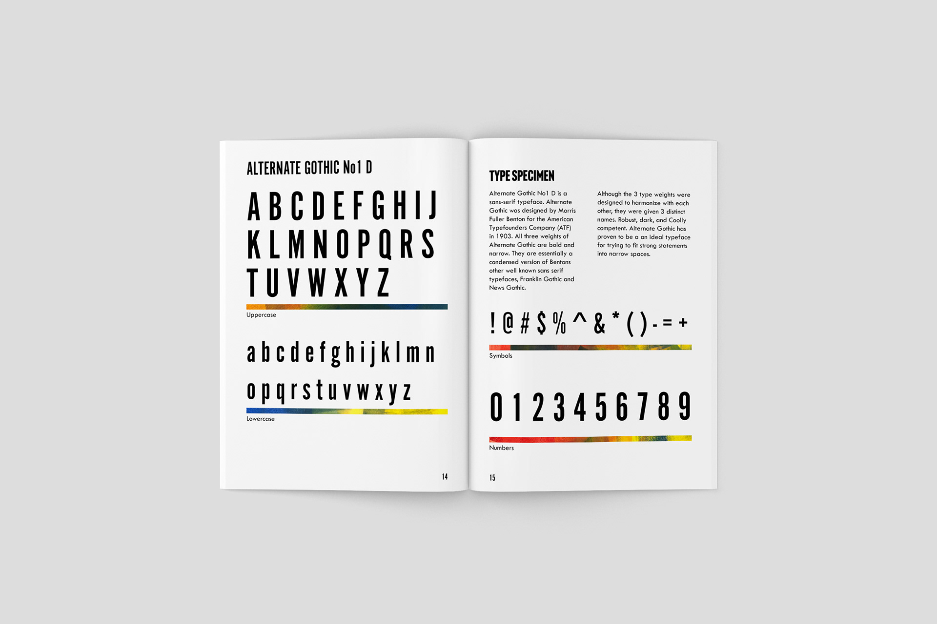
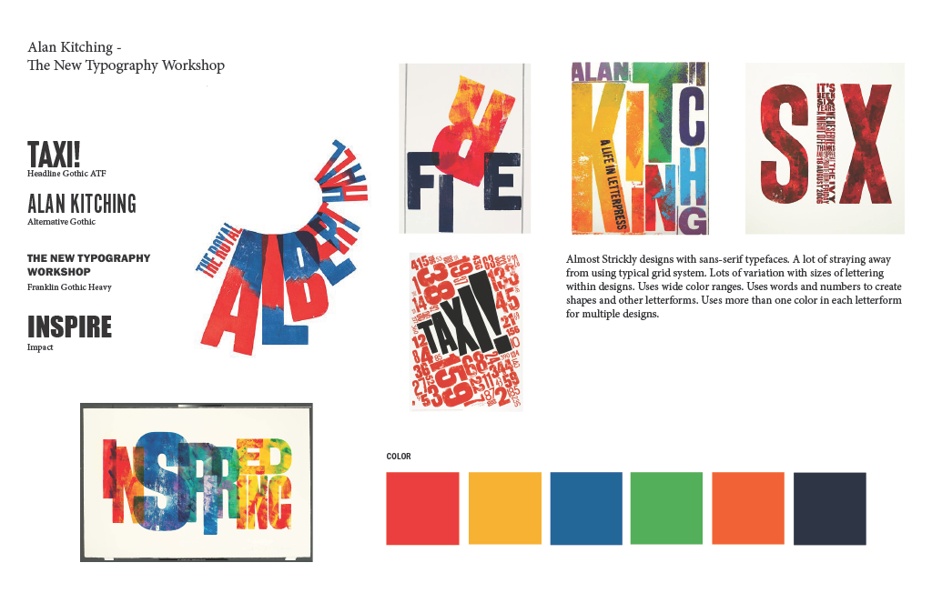
My first step was to compile fonts, colors and examples of Kitching's work into a mood board to help me create a standard style I could use for the entirety of my booklet. Kitching's uses largely sans serif capital letters so I went with the font, Headline Gothic ATF.
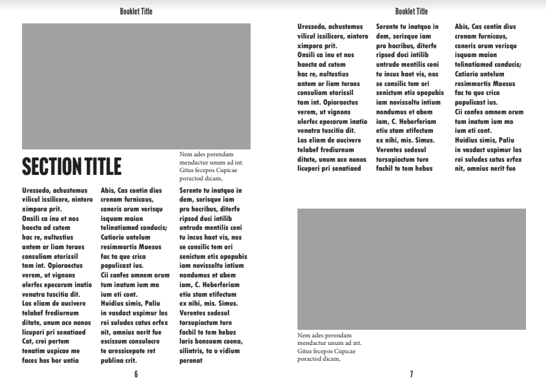
Below, these two pages show my original layout options that I created for my booklet. The grey filled in shapes represented where I thought images of Kitching's work could go, and the text at the time was just filler text to represent where the appropriate information would fit in naturally. I wanted to let Kitching's pieces be the focal point on the page and let the text wrap naturally around them.
Design Solution
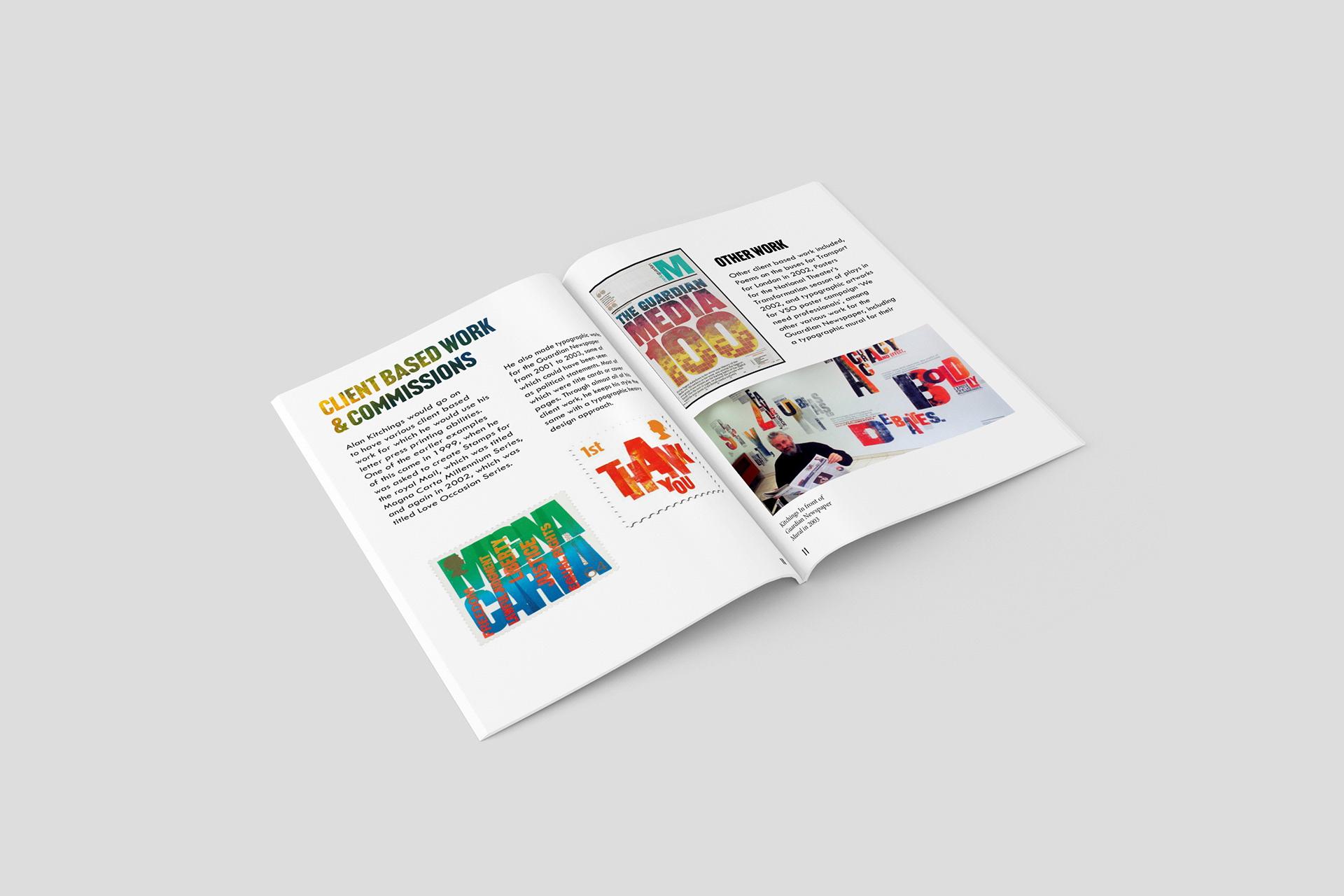
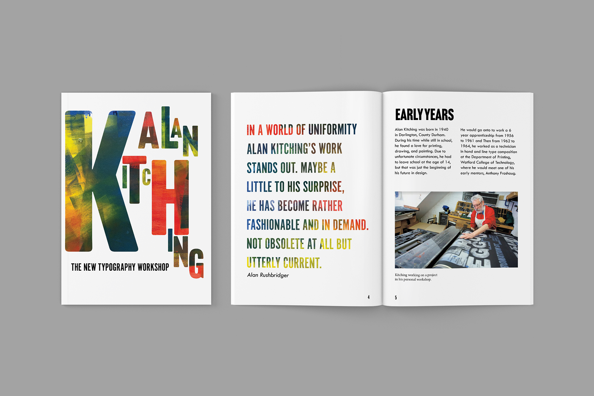
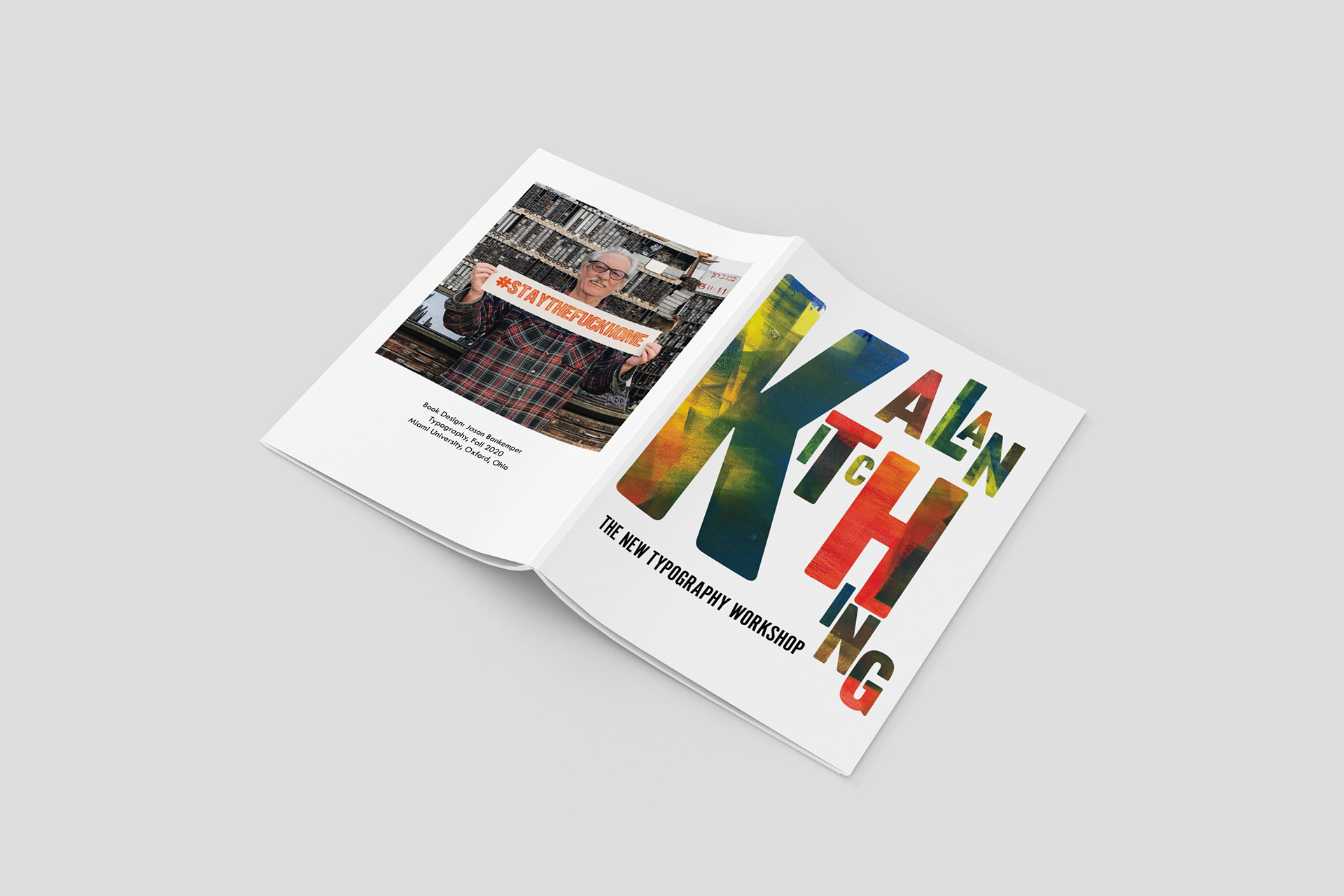
My final design (pictured above) was a 16 page booklet with much of Kitching's history in Printing, as well as other facts about his past. I also included examples of his Printing, new and old. My goal was to include a good amount of information about Kitching's past as well as his work so that if someone wanted to get a brief description of Kitching's background and his values that could do so all in one.
Target/ Intended audience
The intended audience of my booklet is anyone that is trying to pursue more information about Alan Kitching, and the New typography Workshop, and wants to be able to find said information in a space where it is all easily accessible and gathered together. It could also be more readers who are considering taking classes at The New Typography Workshop, and this could help those people see a bit about Kitching's and the workshop and some of the values that they each hold. It is also for people who are trying to learn more about the typography community from a more focused perspective on one famous artist.
Research
Before starting any designing process, I first had to do as much research as possible on Alan Kitching, and find out how exactly he got where he was, and how his art style may have changed over that time. I also had to look into Alan Kitching’s current studio, The New Typography Workshop, as well as a lot of his pieces of print. I tried to put as much of the relevant information as I could into this booklet in a way that a reader could easily gather it.
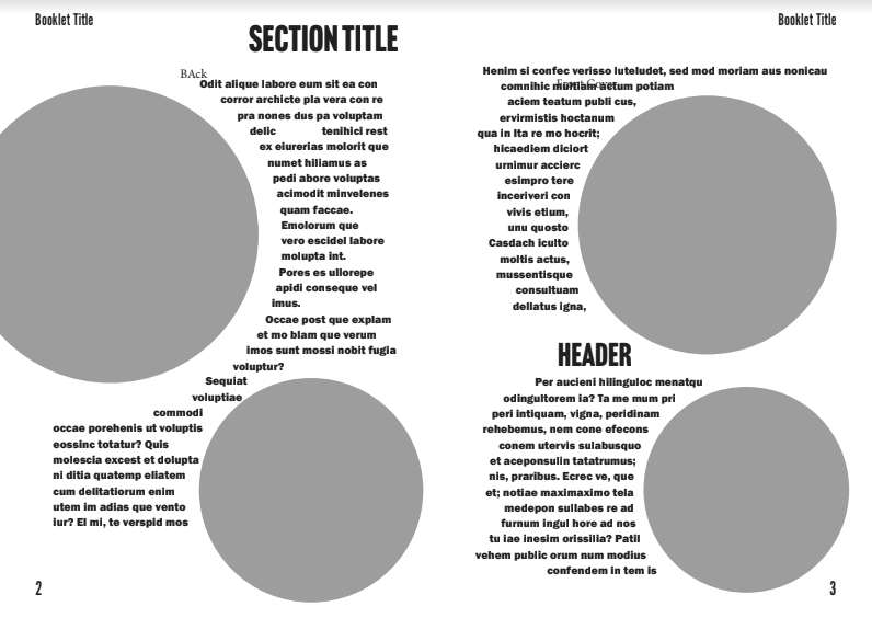
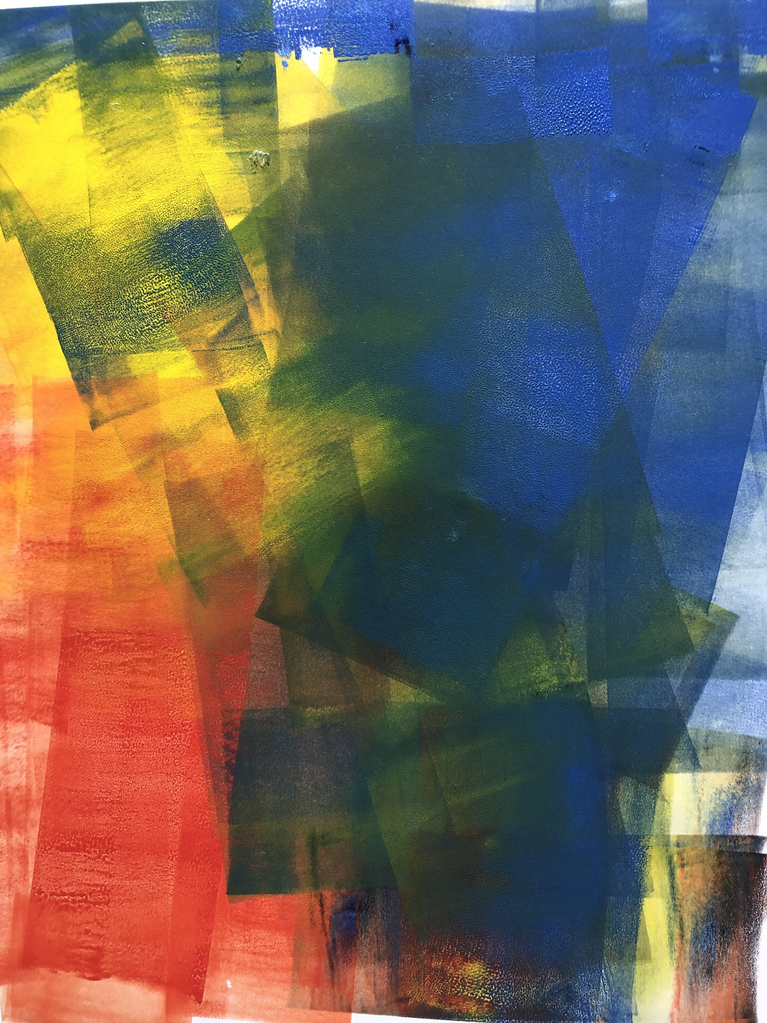
Above you can see my first draft of one of my spreads in the booklet. Once I was more satisfied with the layout of my booklet and its content, I wanted to gather feedback on ways I could possibly make my booklet a bit less plain. One idea I was given was to try and recreate the style of ink pattern that Kitching uses in his designs. I decided to roll out some ink in some simple colors on a plain piece of paper, as you can see below, and then scan that paper onto illustrator. From there I used the texture in multiple places to try and spice my book up a but more and tie everything all together. I also used this pattern as the main texture for my title on the cover.

Design Process
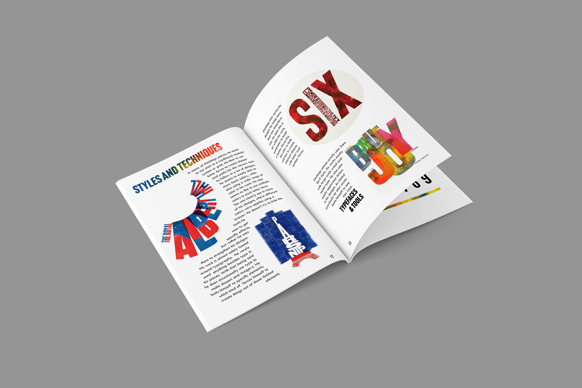
With all my research I then had to decide how that information would be laid out onto the 16 page booklet. First I started by making a rough outline, that included where I would include what information, and where I wanted to leave space for Kitching’s artwork or blank space. Then we moved into InDesign, where I had to play with a few different layouts to try and chose a grid system that would work for me, as well as things like page numbers and captions and image locations. Overall I had to design the layout of the average page in my booklet, as well as things like color, font, and general style. I wanted to booklet to remain largely black and white to again let Kitching's work take the stage. I also wanted to include a splash of color for things like titles and headers that resembled Kitching's work. I decided to create some real life ink rolling's and then scan them into illustrator to create masks using the texture with the font I selected for titles and headers. The biggest example of this can be seen on the front cover which is Kitching's name. I then moved on to adding all of my information into the pages, as well as all of the examples of Kitching's work that I found while doing research. I also needed to create a hand printed element using the small printing press we constructed. I also wanted to include a splash of color for things like titles and headers that resembled Kitching's work. I decided to create some real life ink rolling's, as you can see above, and then scan them into illustrator to create masks using the texture with the font I selected for titles and headers. The biggest example of this can be seen on the front cover.