Project Description
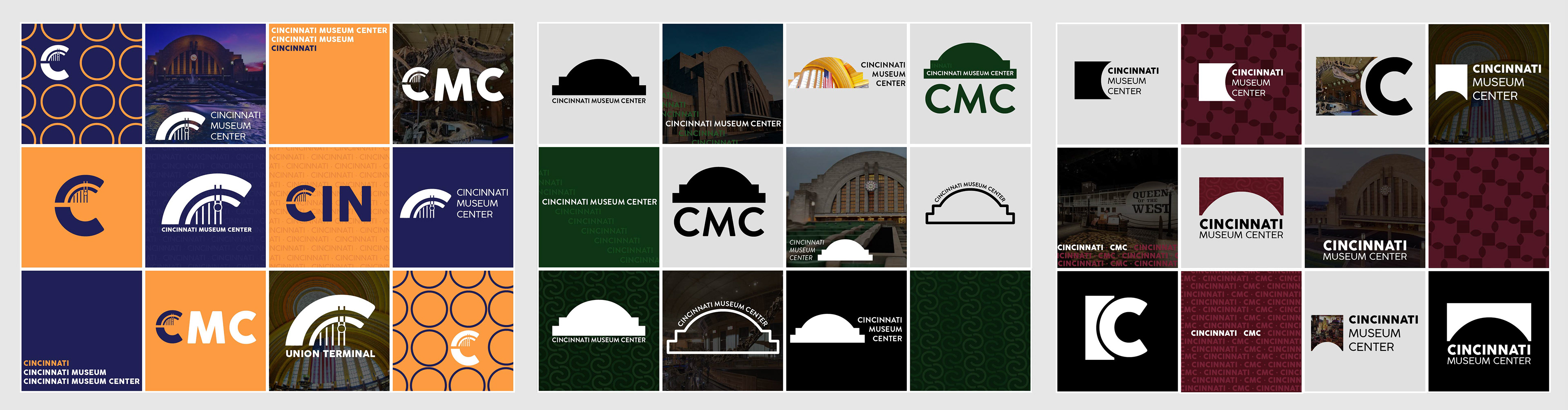
I was tasked with creating a more flexible brand for the Cincinnati Museum Center. When looking at the current branding that the CMC uses, there were multiple opportunities for them to use strategies that showcase more of what is encompassed within the museum. With that being said, my main goal with this rebrand was to shed more light on the structure where the museum finds it’s home. Union Terminal has gone through many changes since it’s construction finished in 1933, but one thing has held true, and that is it’s iconic front facade. People from all over recognize that shape, so we want to use it to my advantage.
Knowing that I created example sheets for 3 different styles that all used some part of Union Terminal in their design. Each style was similar, but had unique aspects I pulled from the museum. From there I moved forward with the far left, orange and blue option.
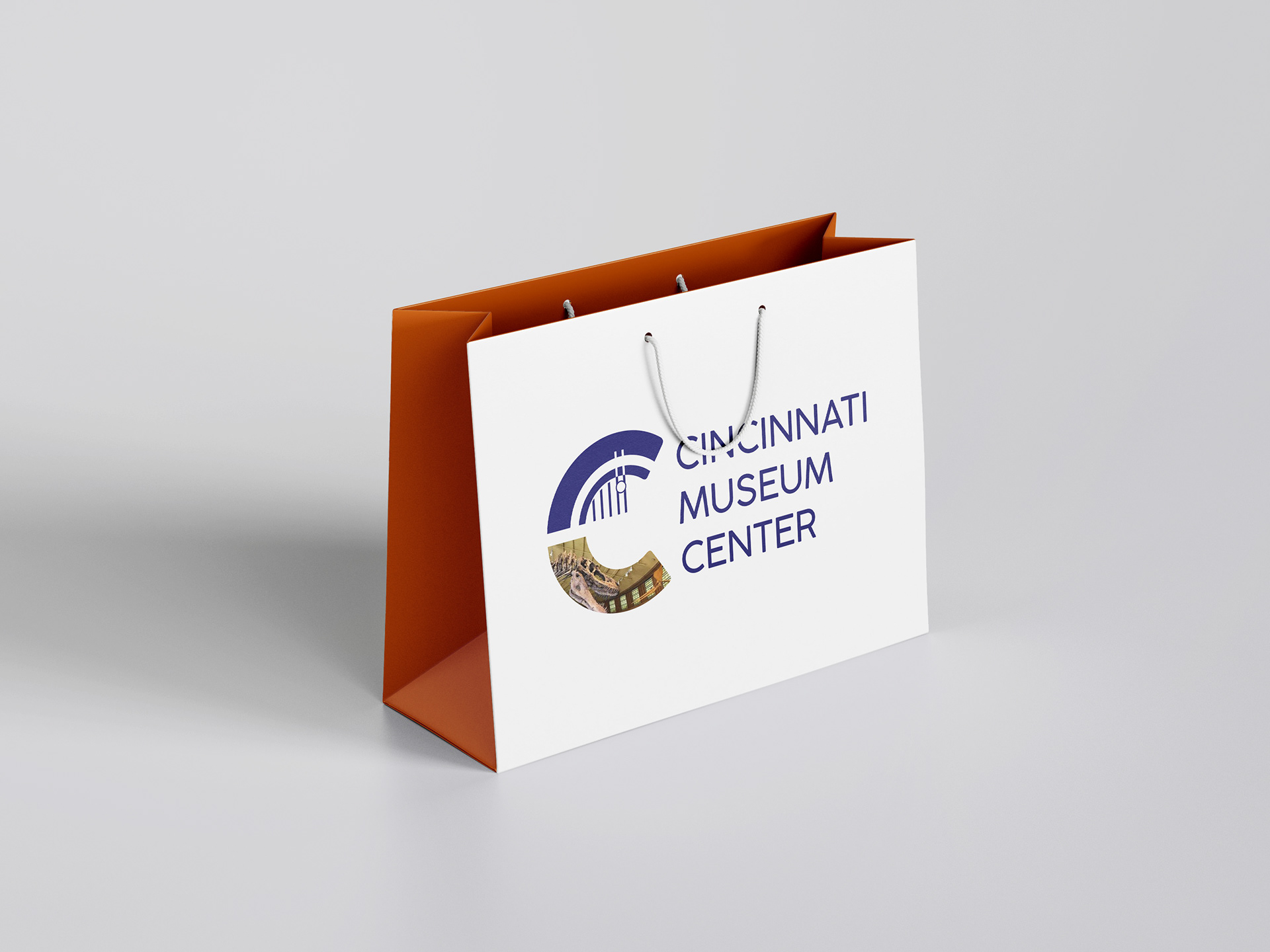
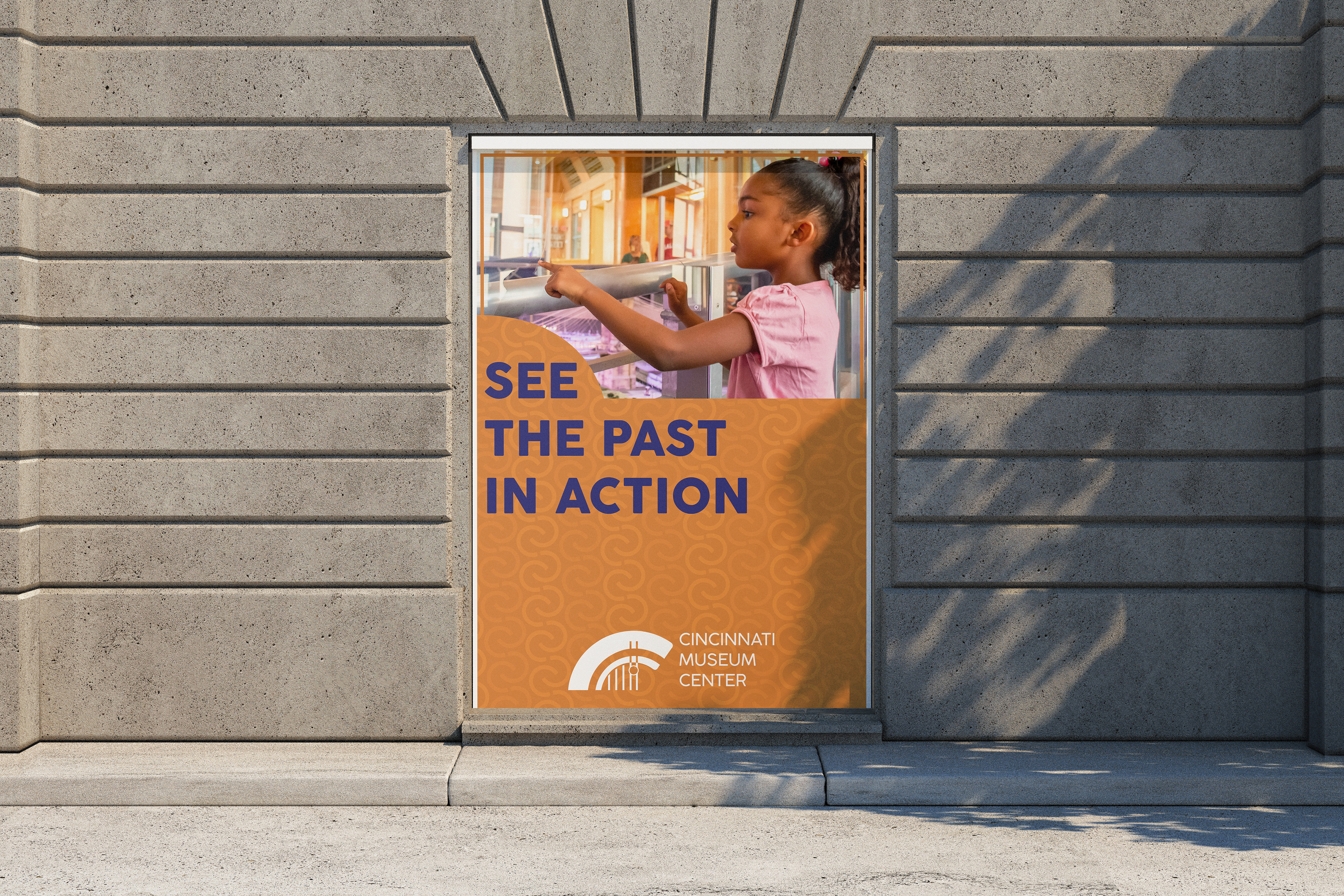
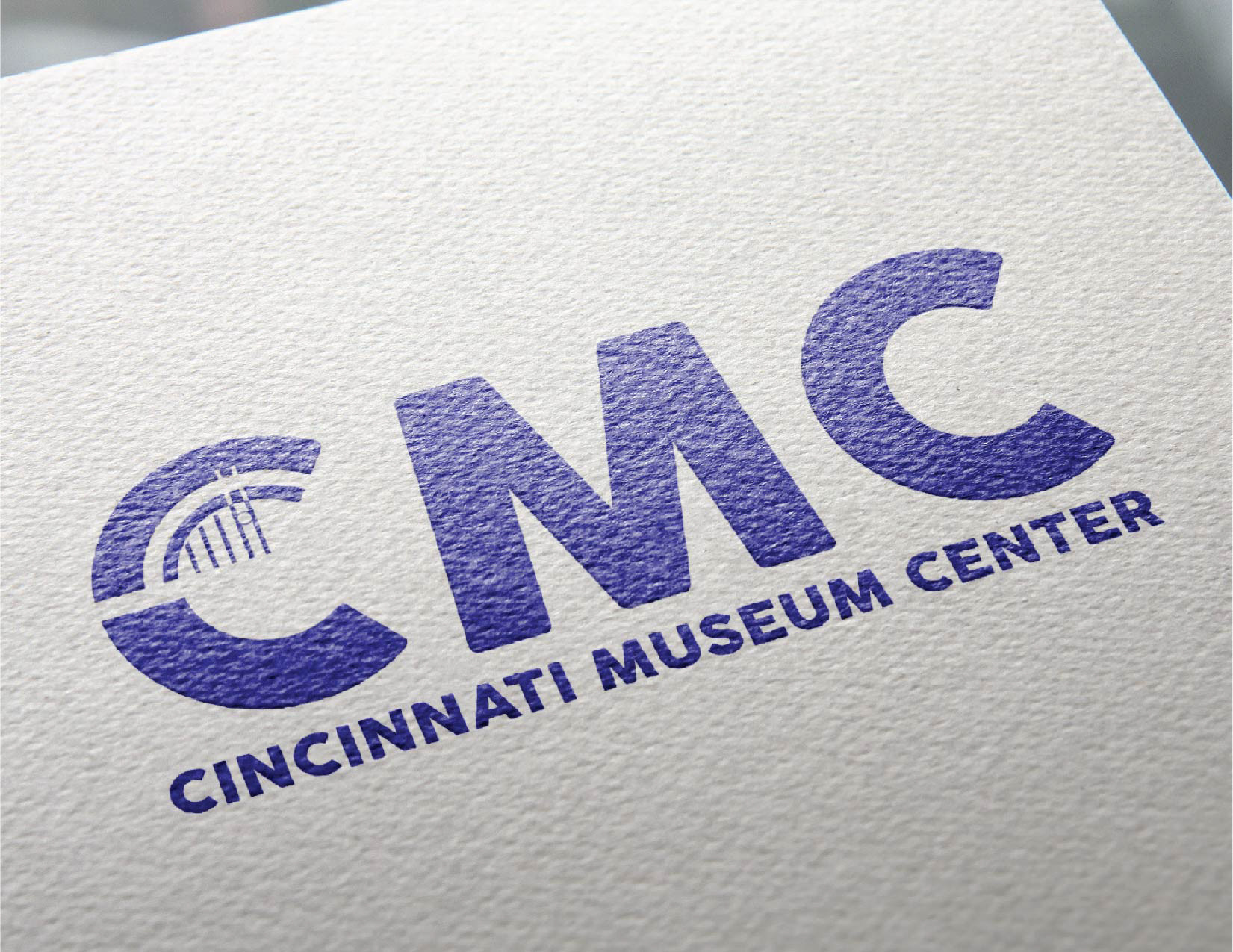
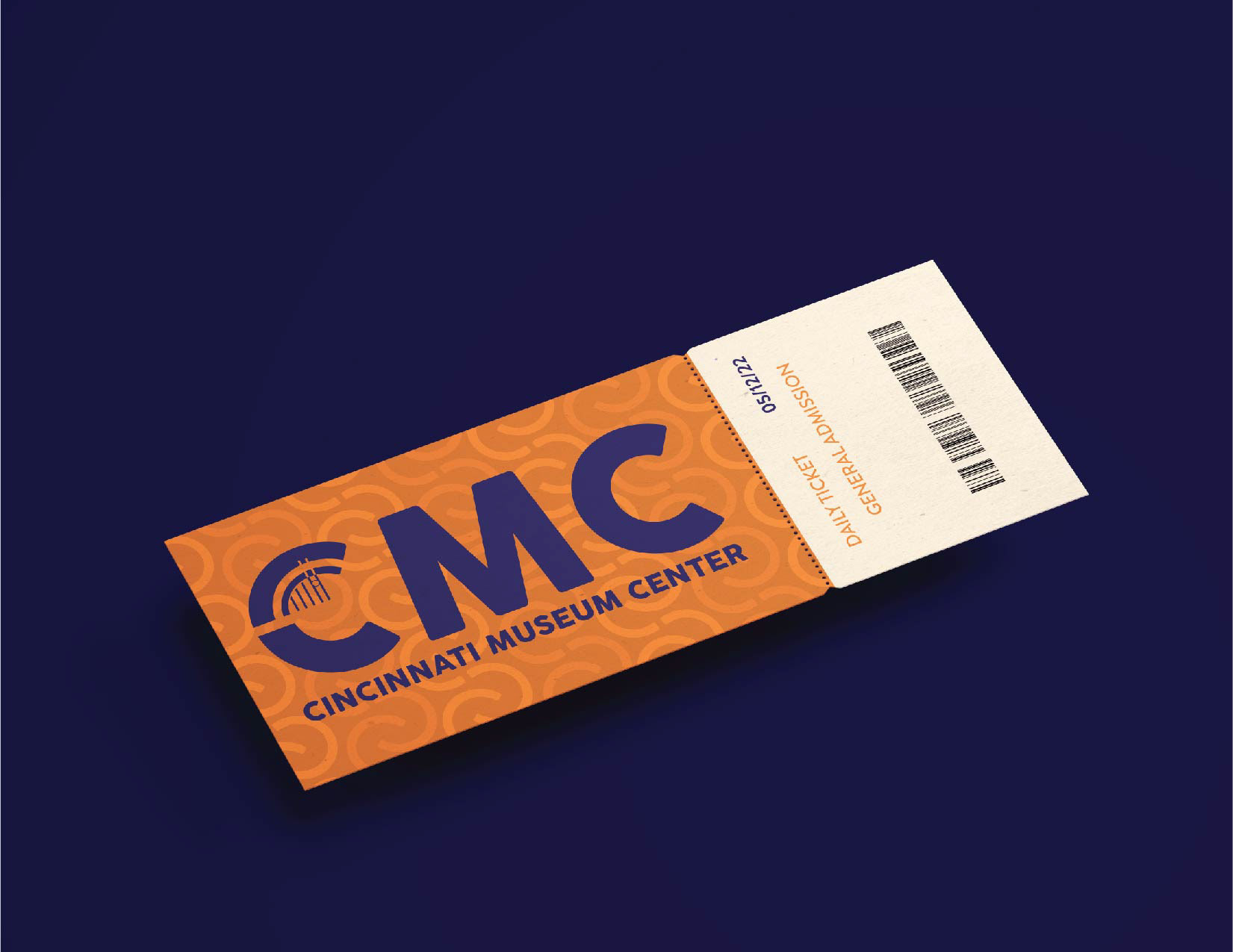
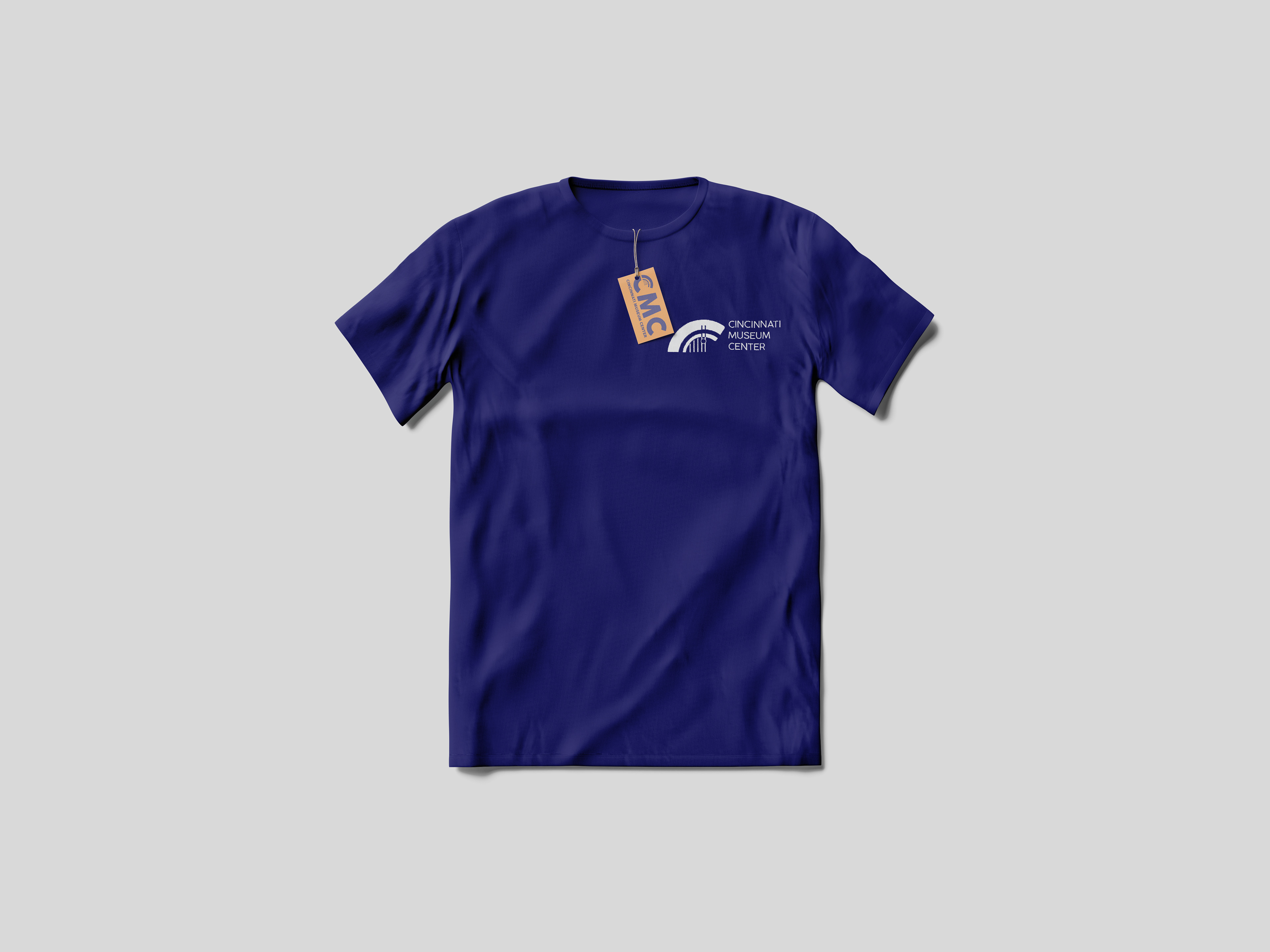
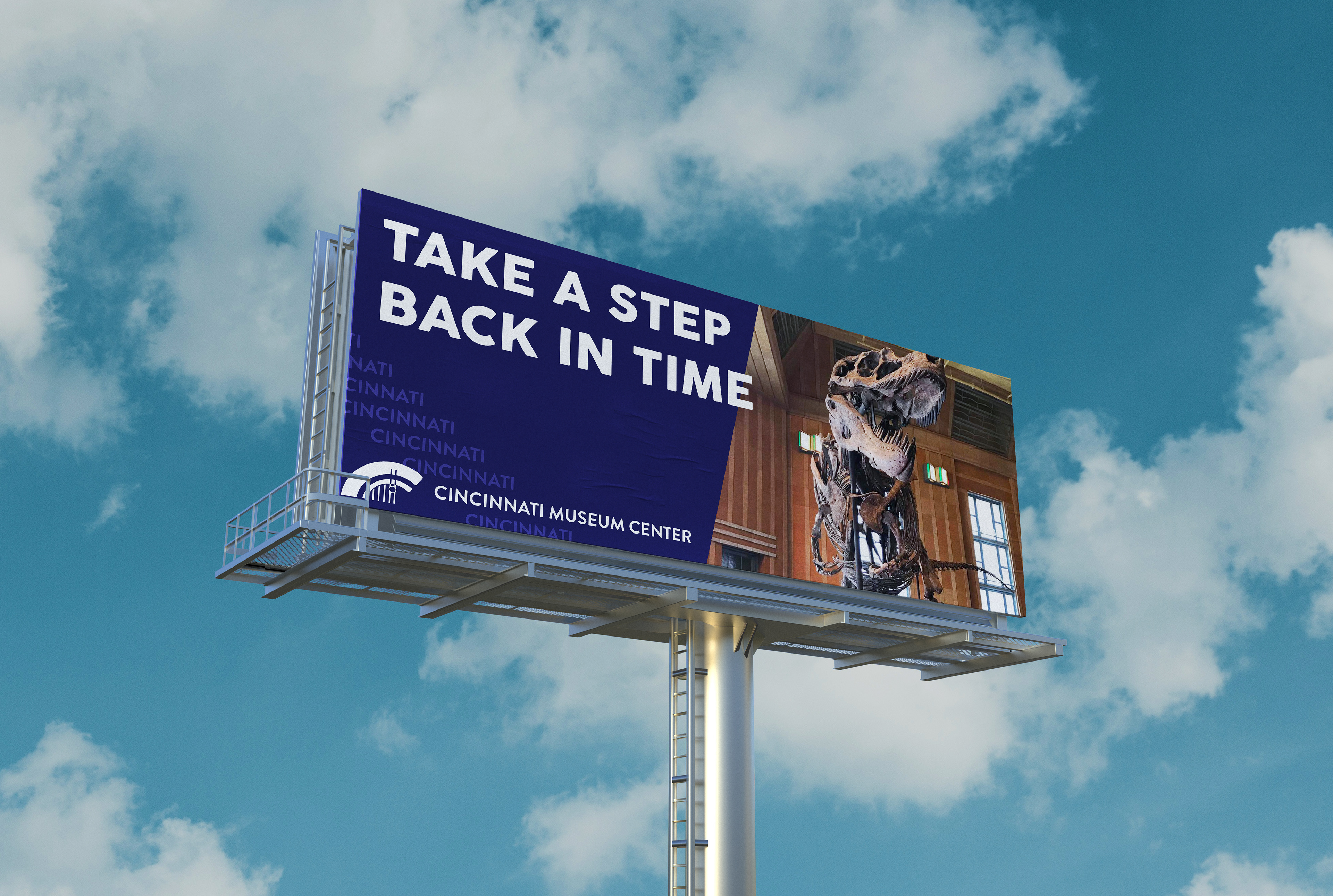
Next, I used the elements I created from the far left example to fully build out the logos, lock-ups, and patterns. Once I had those fleshed out, I took my standards and placed them in a brand guidelines booklet. Once I was fully set on the brand standards, I used the elements to create applications that would be used inside and as advertisements for the Cincinnati Museum Center, which can be viewed below.